Choosing kitchen cabinets isn’t just about storage—it’s about style, mood, and the overall ambiance of the space. Color plays a bigger role than people expect. It can make a small kitchen feel spacious or add warmth to a modern one. The right shade brings everything together—from countertops to lighting. Cabinet color isn’t just a detail—it sets the tone.
Best Colors for Kitchen Cabinets in Modern Homes
Modern kitchens are about style, function, and comfort. Cabinet color plays a significant role in achieving all three. Whatever cabinet style you choose, color defines the space.
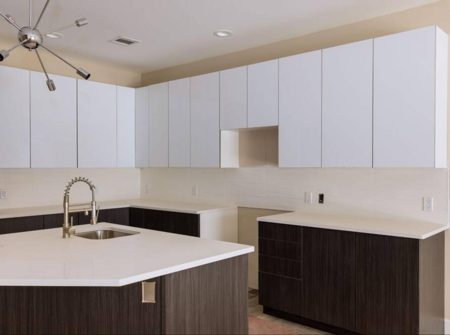
White: Clean, Bright, and Timeless
White cabinets still dominate modern kitchens, and for good reason. They make the room feel open, even in tight spaces. White works well with stainless steel and light wood. It’s also flexible and easy to update with new hardware or backsplash. If you want a safe choice with staying power, white is it.
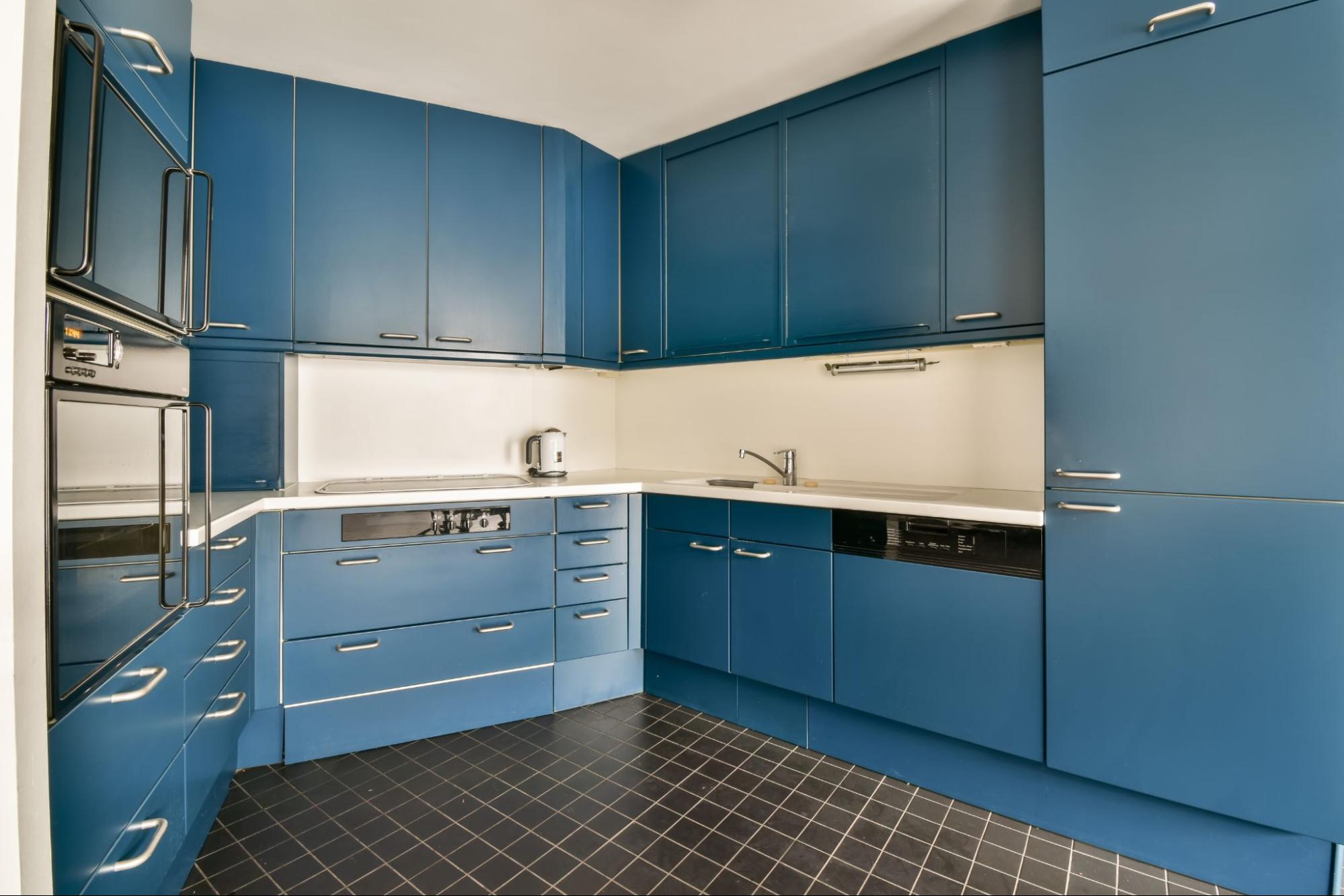
Navy Blue: Bold but Balanced
Navy blue is popular because it looks rich but not loud. It pairs well with brass or matte black hardware. Use it for lower cabinets or a kitchen island to ground the room. It gives a sleek, designer look without going full high-gloss. Navy works best with white walls or light countertops.
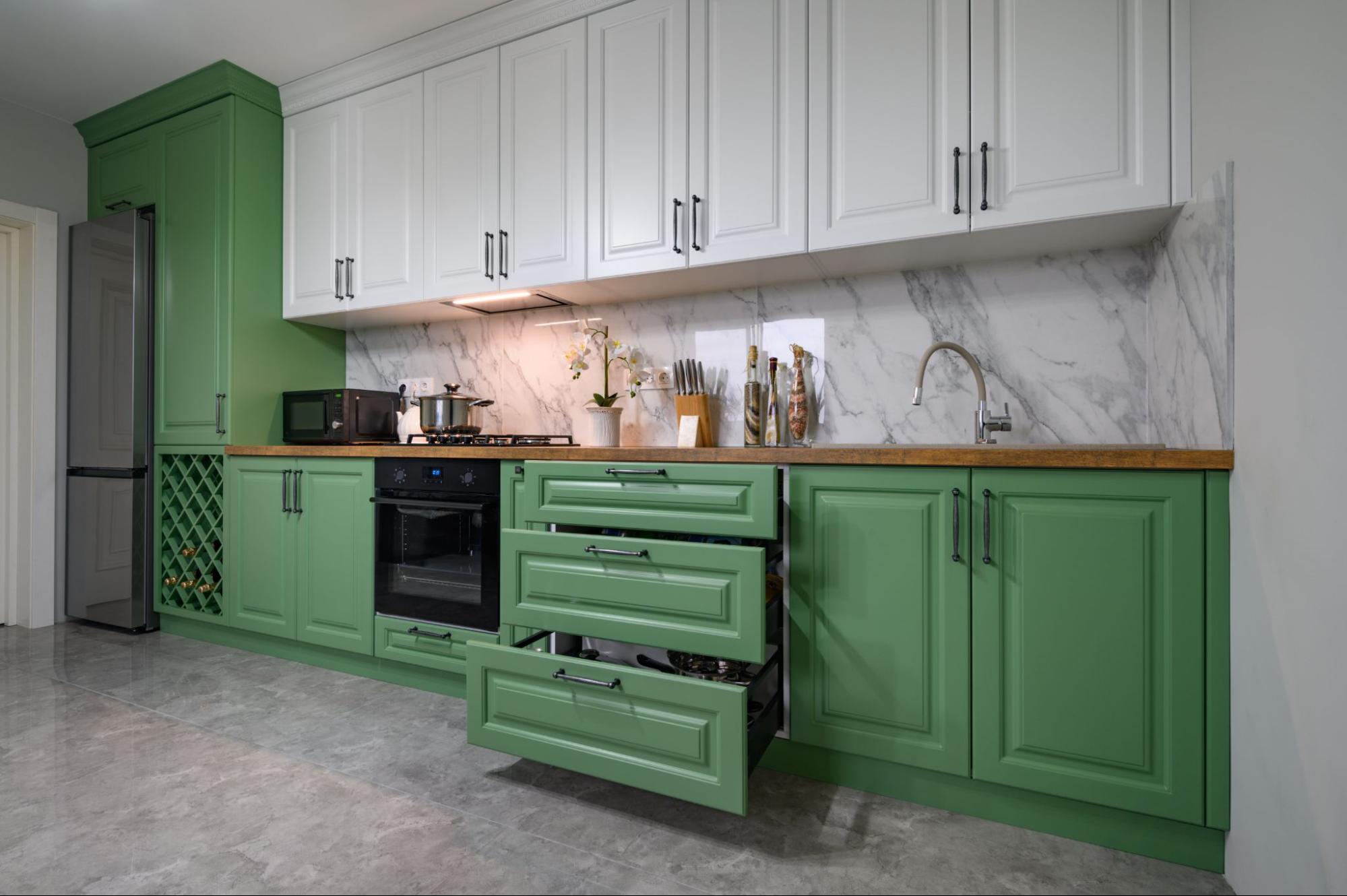
Forest Green: Natural and Earthy Appeal
Forest green adds warmth while still being calm. It’s a go-to for people who want color but not chaos. It works well with wood tones, gold finishes, or even butcher-block counters. It looks great in homes that lean towards a rustic or boho style.
Charcoal Gray: Sleek and Understated
Charcoal gray brings depth without going all-black. It hides scuffs better than lighter colors and feels more grounded. This shade works well in open-concept spaces that need some contrast. Pair it with white or oak countertops for a balanced look. It gives Flat-pack cabinets a more custom, finished look.
Light Taupe: Warm Neutrals for Cozy Kitchens
Light taupe sits between gray and beige, feeling warmer than both. It works with most metals and counter styles. Taupe feels calm and cozy, making it ideal for homes where the kitchen serves as the hub. It’s also a great pick if you’re selling—buyers often like neutral tones.
Best Colors for Kitchen Cabinets Based on Cabinet Styles
Cabinet style shapes your color options more than most people think. What looks good on a flat-pack setup may not be suitable for an Amish-built frame. Match your color to your cabinet design to get a cohesive look.
Best Colors That Highlight Shaker Cabinets
Shaker cabinets have clean lines, so bold or soft tones work well. White and navy are top picks because they make the style pop. Sage green and slate gray also add personality without being flashy. These colors bring out the cabinet’s design instead of hiding it. Use matte or satin finishes for best results.
Classic Tones for Amish Cabinets
Amish cabinets are known for solid craftsmanship and traditional looks. Deep cherry, walnut, and off-white work well here. These tones match the cabinet’s handmade quality and natural wood features. Soft cream or muted green can add a personal touch. Avoid overly glossy finishes—they can clash with the style’s rustic roots.
Smart Colors for Flat-Pack Cabinets
Flat-pack cabinets are great for quick installs and tight budgets. White, taupe, or light gray colors make them look more expensive. They’re also more likely to be in stock, which speeds up cabinet delivery. Stick to sleek, clean colors to keep the modern vibe. You can always upgrade with new hardware later.
The Best Colors for Kitchen Cabinets by Space and Light
The size and lighting of your kitchen can limit what colors work. Some shades shrink a space, while others make it feel larger. Always test samples in your actual kitchen light.
Light Tones for Small Kitchens to Expand the Room
Light colors like white, cream, or soft blue open up small kitchens. These shades reflect light, creating the illusion of space. Flat finishes keep things from feeling too sterile. If balanced right, darker colors can still be used for lower cabinets. Avoid using dark shades on all cabinets in small rooms.
Darker Colors for Large Kitchens to Add Depth
Large kitchens can handle deeper shades like navy, green, or charcoal. These colors help anchor the space and add contrast. Use them on islands or feature walls for effect. Pair with light countertops to keep things balanced. Shaker or panel styles in dark colors give a classic, rich look.
Color Choices That Work Best
Natural light brings out the actual color better than artificial bulbs. If your kitchen has many windows, you’re safe with most tones. But in darker spaces, avoid deep colors that absorb light. Stick to soft neutrals or light pastels to brighten things. Always check samples at different times of the day.
Best Colors for Kitchen Cabinets That Affect Your Mood
The kitchen isn’t just for cooking—it’s where moods shift and conversations happen. Cabinet color can shape how people feel and interact in the space. Some shades energize a kitchen, while others help it feel calm.
Warm Colors That Stimulate Appetite
Warm tones, such as muted red, terracotta, or soft gold, can increase appetite. These shades create a warm and inviting atmosphere, giving the kitchen a welcoming feel. They work best in kitchens where people gather often for meals. If full red feels too bold, use it on lower cabinets or as an accent. Stick to earthy versions, not bright primaries.
Cool Colors That Promote Calm and Focus
Cool colors like sage, soft gray-blue, and dusty teal help reduce stress. These shades make kitchens feel calm and organized. They’re great for open-plan spaces that flow into living rooms. If you spend a lot of time cooking or cleaning, calming tones help keep the space from feeling hectic. Matte finishes work best with these more fabulous shades.
Balanced Neutrals for Everyday Living
Neutrals like warm white, light taupe, or soft greige hit the balance. They don’t overstimulate or drain energy. These colors blend well with any décor and stay timeless over time. For families or frequent hosts, neutral cabinets offer flexibility. You can always add color through lighting, art, or hardware later.
Best Colors for Kitchen Cabinets That Pair With Counters
Choosing the right cabinet color gets easier when you consider the counters. The two surfaces need to coordinate, not compete with each other. An innovative pairing makes the whole kitchen look intentional.
Best Matches for Cabinets and Quartz Countertops
Quartz counters usually have subtle veining and smooth tones. White cabinets keep the look bright and clean. Charcoal or navy adds contrast and highlights the quartz details. Match cooler quartz with cooler cabinet tones like pale gray or slate. Warm-toned quartz pairs better with creamy whites or soft taupe.
What Works With Marble or Butcher Block
Marble counters are bold, so softer cabinet shades balance them. Light olive, smoky blue, or natural wood tones go well with veined marble. Stick with clean neutrals—white, light gray, or navy- for butcher blocks. These tones make the wood texture the hero. Avoid clashing tones like orange or red unless the wood is very light.
Using Color to Bridge Cabinet and Backsplash Styles
The cabinet color can help connect two clashing surfaces. For example, choose a mid-tone cabinet that blends both if your counters are bold and your backsplash is subtle. A soft green or deep gray often works as a neutral bridge. This approach keeps the design from feeling choppy. Always review samples together before making a decision.
Best Colors for Kitchen Cabinets That Sell Homes Fast
Many homeowners pick cabinet colors with resale in mind. Buyers want kitchens that feel clean, fresh, and ready to use, and color plays a huge role in that impression. The right shade can help a space look newer, brighter, and more move-in-ready.
Safe Colors That Sell Faster
White, off-white, and soft gray cabinets consistently appeal to buyers. These shades feel clean, and help buyers imagine their style in the space. Homes with neutral kitchens tend to sell faster and for a higher price. They also appear better in photos, which is important in online listings. Avoid using trendy colors if you plan to sell soon.
Trendy Colors That Could Turn Buyers Away
Bold colors like deep red, bright yellow, or mint green can be polarizing. While stylish, they can limit the buyer pool. If you must use a bold tone, consider doing it on just the island. That makes it easier to repaint if needed. The goal is to appeal to as many people as possible.
Color Choices That Boost Perceived Value
Deep navy, matte black, and natural wood tones can add a sense of luxury. These shades exude a high-end feel when paired with gold or black hardware. Combine them with light countertops to avoid a closed-in look. Dark cabinets in the proper layout can make the space feel custom. Just make sure there’s enough light to balance them out.
Best Colors for Kitchen Cabinets Begin With One Bold Pick
There’s no single perfect color—only the one that fits your kitchen, life, and style. Trends fade, but how you feel in your space lasts. Start with one bold decision: choose the cabinet color that makes you pause and say, “Yes, that’s it.” Everything else falls into place from that choice—cabinet design, workflow, and even daily routines. If you’re still staring at samples, trust your gut and go with the one that speaks up without trying too hard.
Explore more expert tips and cabinet inspiration on the North American Cabinet LLC blog.